CAER Student Logo Design Showcase
This showcase presents the student-designed identity selected for CAER, together with six runner-up concepts.
SELECTED DESIGN
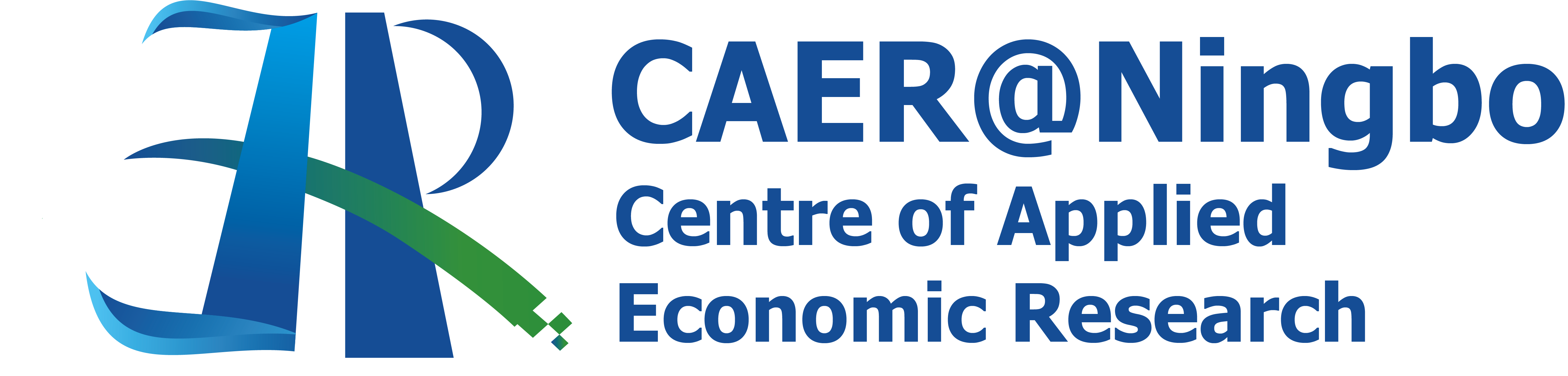 Designed by Xinyi Wang
Design concept
The selected logo brings CAER's initials together with symbols of Ningbo, applied scholarship and future-facing research. A subtly mirrored C represents the Centre and its role in connecting academic research with society. The bridge-shaped A stands for Applied and links economic theory with real-world challenges. Inspired by the confluence of Ningbo's three rivers, the flowing E represents Economic research while suggesting regional development and sustainability. The data-stream R signifies Research and the growing role of data, digital technologies and AI in economic inquiry.
Deep blue conveys academic rigour and intellectual depth. Water, bridge and data-flow elements combine to express CAER's commitment to advancing applied economic research in the AI era.
Runner up designs
The following concepts were recognised as runner-up designs. Each offers a distinct interpretation of CAER's identity.
Acknowledgements
CAER thanks all participating students for their creativity and thoughtful engagement with the Centre's mission. Their work demonstrates a wide range of approaches to representing applied economic research, data and Ningbo's regional character.